Aymerick Pilarski, AFC and colorist David Haddad about "Meeting with Pol Pot", directed by Rithy Panh: shedding a hard light on darkness
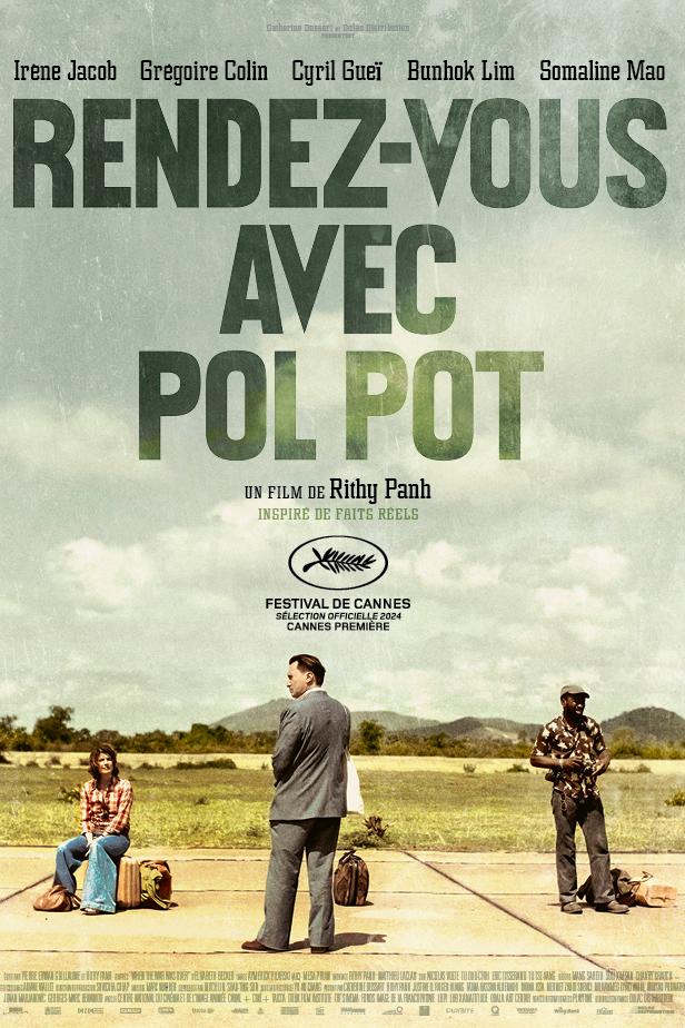

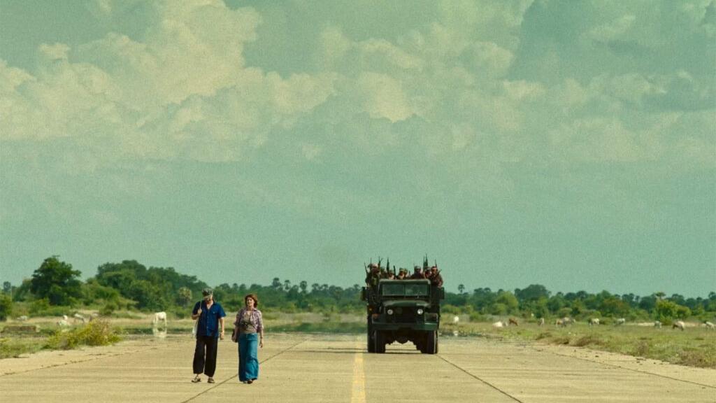
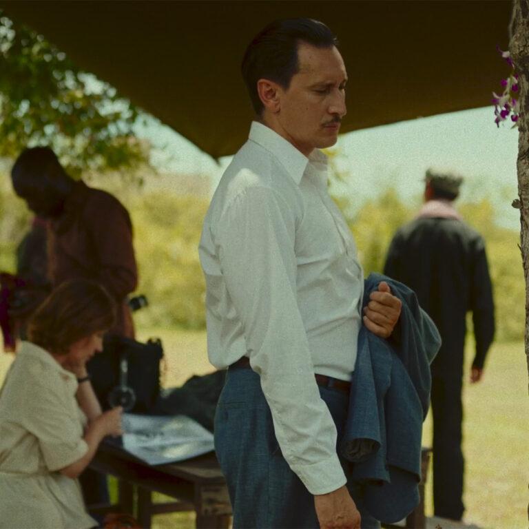
1978, on a tarmac in the middle of the jungle of Cambodia: three French journalists are guests of the Khmer Rouge regime, and promised to meet its leader, Pol Pot. They’re supposed to be shown the success of the regime, yet all they’ll see will be manipulations, illusions, lies, and shadows keeping the slaughter of a people behind the scenes. To film the fictional live action scenes of this hybrid film also made of archive footage and sequences with figurines already seen in one of his previous documentary features "The Missing Image" (2013), director and writer Rithy Panh took cinematographer Aymerick Pilarski, AFC on board for the first time. Although he’s familiar with Asian sets and languages, it was Aymerick's first shoot in Cambodia, and also his first encounter with ZEISS Super Speed lenses, which are probably older than him!
ZEISS: How did you fit into the work of Rithy Panh, who has been building a memory of the genocide perpetrated in Cambodia by the Khmer Rouge regime through numerous films and books?
AYMERICK PILARSKI, AFC: He'd already been working with Prum Mesa, a Cambodian cinematographer, for years, who filmed all the figurine sequences, for example. I came in to take care of the fiction part and propose a different approach to framing and lighting. I immersed myself in his cinema when the producer Catherine Dussart called me, but I didn't want to watch everything so as not to be too influenced, because he wanted something new. I had to understand, but still be able to bring something intuitive and personal to the table. I saw "S-21: The Khmer Rouge Killing Machine" three days before we started shooting, after visiting Phnom Penh, and during the shoot I was reading the book he wrote with Christophe Bataille. We filmed some scenes before I realized they were in the book. He had told me that there would be sequences with figurines like in "The Missing Picture", so I could see where we were going, but I wanted to leave the door open to something else.
But what kind of screenplay did you have?
His initial screenplay was a little different: it was a journey across Cambodia. Lack of time and budget pushed him towards a more condensed and symbolic narrative, because it's not about showing everything about the atrocities either; Rithy has no desire to show genocide. I think it's always smarter to talk about what happened, to give viewers the pieces of the puzzle to complete it themselves.

It's true that it requires some work from the viewer.
It's demanding, but Rithy is aware of it. The title is explicit enough to set out the situation. We don't know who the people are that the three French protagonists first meet, Pol Pot's name is sometimes only said in Khmer, "Brother No. 1" ... It requires commitment to understand, and that's what Rithy wants. It's a risk, but a measured one on his part.
He's really the only one to deal with this subject in cinema, so it must be tough.
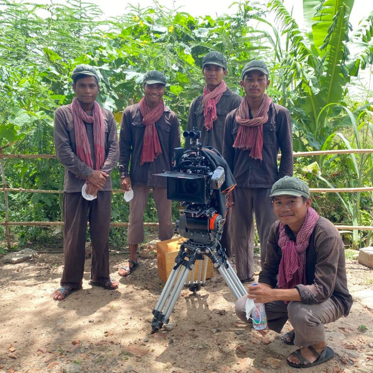
It is his duty to remember. To reconstruct and understand how what happened did happen. He created, the Bophana Center in Phnom Penh, which collects archives on Cambodia from before the arrival of the Khmer Rouges... He trained everyone there, the members of the crew were people he had trained. They're enthusiastic, and they're very good at it! Rithy has this desire not only to train people, to make them aware of their history, but also to give them the means to do things themselves. We had a lot of students on set, both as extras and as part of the technical crew. It was the Cambodians who made this film, who stayed right to the end and never gave up, even at 42°C (107°F) in the sun. I think they’re proud to make their own cinema, telling their own story.
So, you find your place by being yourself.
The producer was looking for someone who was used to working with Asian filmmakers, and it was also a question of personality. She warned me that Rithy is someone who doesn't like conflict, and my experience has often taught me to work with filmmakers who don't say no and who don't want to get angry. Rithy was looking for a collaborator with whom he could exchange artistic ideas and work together to find an aesthetic language for the film.
I started off his desire for fiction and what he said about light, to find out what I could bring to the table. I also had to be an ally to the actors. Every filmmaker is different, and it's only when you talk to them that you understand their references. Rithy is all about "classic cinema", as he puts it himself, "The Night of the Hunter", Godard, Vertov, and Chris Marker, for the editing and repetition of shots. He's a montage filmmaker, he watches lots of footage, his office is a cutting room. He showed me some archives right away. I asked him about black and white, but no, he wanted to keep it modern. Black and white was for the archives, color for the narrative. And the 4:3 aspect ratio came as much from the references ("The Night of the Hunter", "Alphaville") as from the archives, and also from his relationship with portraits. It also worked with the claustrophobic aspect of the story.


But there was a need for consistency.
He never told me he wanted a 70s style for the narrative part, but I wanted to avoid visual skips that would look fake. There's always a kind of a trap when you have different storytelling modalities. Certain aesthetic or re-enactment choices can be misinterpreted, if they're poorly executed.
That's the danger, talking about death with aesthetic images, that’s a tightrope to walk. Did you two talk about aesthetics?
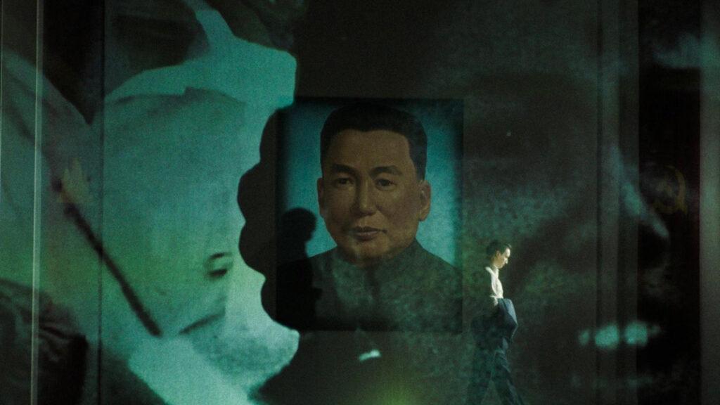
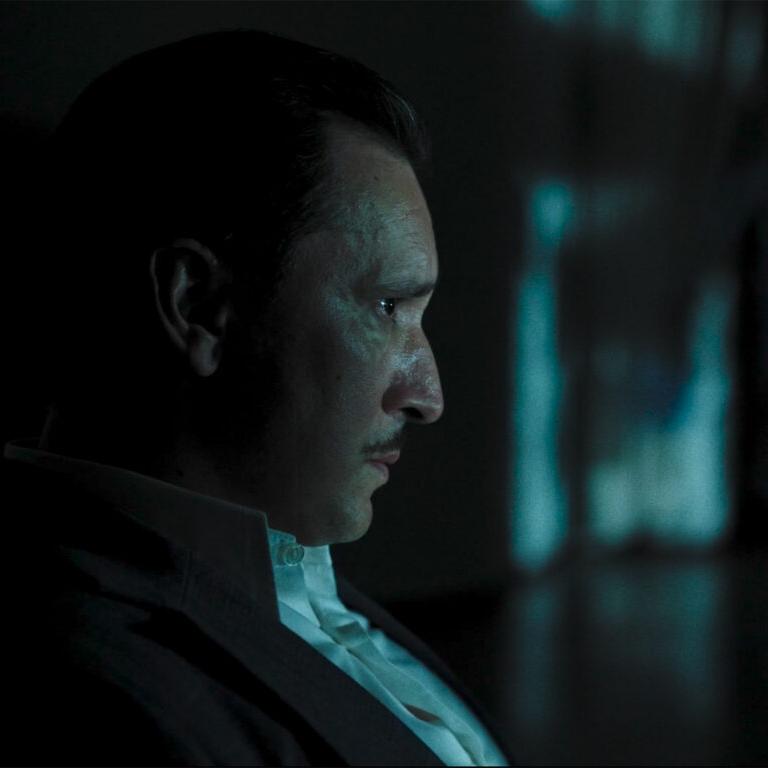
We did, and he didn't want a 'Hollywood' style, especially when it came to lighting. For example, he doesn't understand over-lit night scenes, "it's not like that in real life". Still, there are certain points of departure from naturalism. "The Night of the Hunter", for example, is very stylized, with its screenings, shadows and abstract, absurd world, and that's what interested us: playing with screens and projections to conjure up what’s off-screen, so that danger is everywhere and, above all, to create a fake environment. How can we make the characters travel both in their heads and physically when we're stuck in a single place, this tarmac? And underline just how absurd, how much of a farce the Khmer Rouge regime was. The word "absurd" comes up a lot, and there's a reference to Beckett’s "Godot". When they arrive in Phnom Penh by car, you see the city in images projected onto screen: you know it's not true, and that's the point. He also liked the handmade aspect, with the figurines, but also in the filming: everything is done in camera, on set, even things that would have been easy to do in post-production. We pulled tulle cloth, solved parallax and hot spot problems with the projectors...

Did you get a chance to try all this out in France before leaving for Cambodia?
It was complicated, because there's not much equipment in Cambodia, and we agreed to leave over there everything we bought in France, so that Cambodians could use it for their shoots. I did a few tests here with live performance technicians, but in the end, I picked a consumer 4K projector. We had to be able to project onto any material, day or night... I set out with the canvases and tulles, not knowing if they would be the right size, if there would be enough light, all kinds of unknowns. We received the equipment the day before the shoot and realized the constraints on the set: you learn by doing. We also had "pico" projectors, which saved our lives: on the mosquito net with Irène Jacob, it's a pico, because the room was small, and we didn't have the distance for a bigger projector. Rithy insisted on these projections, and we shot a lot of them. The film could have been made with the three characters in a hangar, and only projected images, a la "Dogville"... The script evolved towards such abstraction.
Still, there are period markers in your image.
Yes, I didn't want to go with too modern a look and equipment. Two months before shooting in Cambodia, with two of his team and an Alexa Mini, we filmed locations over half a day. This allowed us to validate the 4:3 ratio. The slight "period" look I'd applied to these Rec 709 tests didn't shock Rithy. We went back to Paris to rent the camera and lenses, and that's when I tried vintage lenses, to try not to be too contemporary. At TSF, Aurélien Branthomme showed me seven sets, between primes and zoom lenses. I was able to watch the blind tests on a big screen: we looked at texture, contrast, bokeh and the dimensional aspect of the portraits. I turned to the ZEISS Super Speeds, which I knew absolutely nothing about. I had no preconceived ideas. I tried from 25mm to 75mm, and that's when I noticed the triangular bokeh. On the test bench, these weren't necessarily the lenses I would have chosen, but it was when I looked at the images on the big screen that I understood. I wondered if it was too much, but there was no need to be "normal" or "natural" for the film. Most viewers don't notice it, but there's still a feeling, the foliage taking on this blade-like shape... It's an overall feeling that appealed to me.

Did you have a go-to focal length and T stop for the shoot?
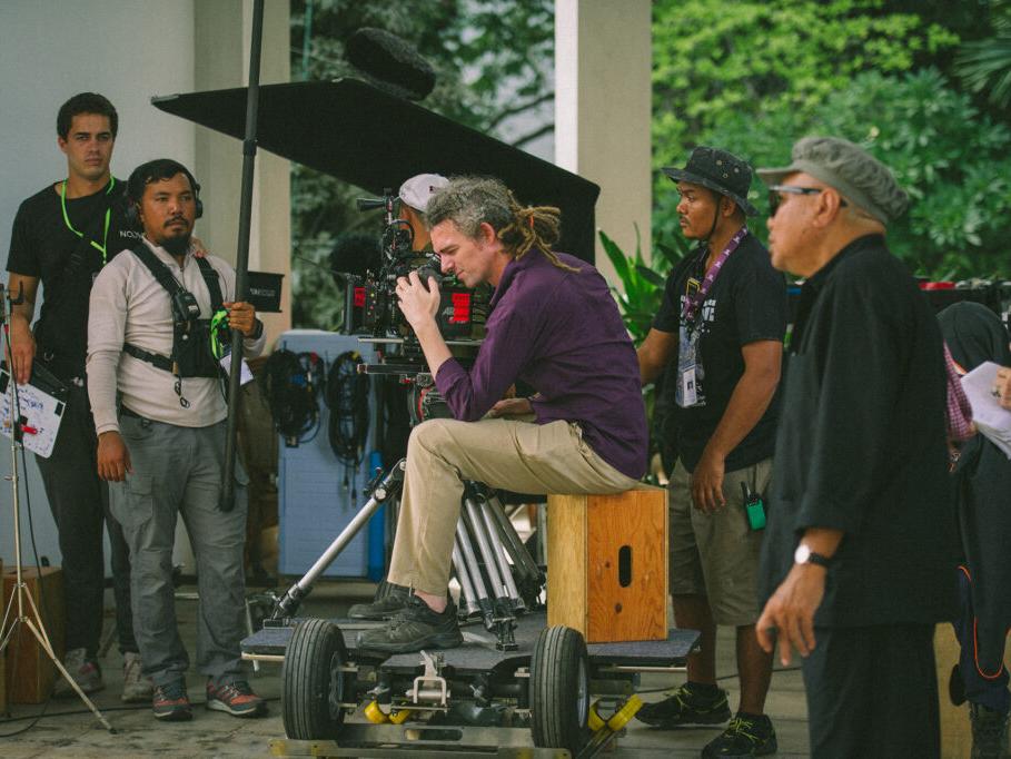
I like to try and keep the same focal length, even if it's rarely possible. The 50mm was used a lot, rarely tighter, and also the 35. After a while, my assistant systematically mounted the 50mm every morning. We used the 80-200 T2.8 Morpheus TLS zoom for the longer focal lengths. It had a softness that I liked, it was easier to focus, and matched very well with the primes. I needed a zoom lens: when you're working for the first time with a filmmaker whose habits you don't know, and on unfamiliar locations... We didn't shoot any zoom movements: they could have added to the period feel, but they can also be voyeuristic, "look at what we're showing you". It would have been a trap to reproduce the zooms seen in the archives, which are reports, and Rithy never asked me to do it.
Aperture-wise, we were shooting at around T2.8; sometimes at T1.3 to blur the backgrounds, but there are certain three-shots that I'm seeing again now and for which I think it may not have been the right choice... I would have liked to use the lenses more at full aperture, but with a different shooting setup, with more time to rehearse, for example. At night we did shoot below T2, although the AC, Socheat Cheng, couldn't see anything on his monitor – he's good!

Let's talk about the night scenes: there are several types of night.
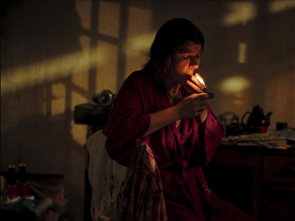
Rithy wants the nights to be extremely dark and contrasted, even if it means not being able to see certain things, which is fine by me. Sometimes on set, he was the one asking for more darkness. On the monitor, which he finally accepted (he didn't want one at first), sometimes you couldn't see much, but he said he trusted me. With the gaffer, we set ourselves 1970s constraints: no LEDs at all, and tungsten, for the quality of the light and for the shadows. For the nights, we used as few sources as possible, as much tungsten as possible. "If we use a single source, what does it look like?” Indoors, it's sometimes just a 5KW coming in through the window. The texture of the windows, the bars give shadows that can be enough. We'd see what it would look like with a single source, and then add a bit more, or move it around. This went hand in hand with Rithy's direction: he has the scene in mind but doesn't necessarily tell you, and you discover that there are twenty extras or that the set is a certain size. We try to cover up and light more surface area, but there wasn't much time for lighting either. For some scenes, we relied on the Jeep's headlights, and improvised with the elements in the shot. I stayed at ISO 800 on the Alexa Mini, but we were shooting RAW. I would do the dailies in the evening, and we had two LUTs, for day and for night, so I could see that we had some leeway. On the dailies I delivered the blacks were a little off for the night scenes, but as sometimes happens, the LUT didn't follow up, and in the edit they only had the day LUT, whose blacks were much darker. And that suited Rithy. It was reassuring, because as soon as they started editing, he got used to high-contrast image


Let's talk about those contrast and blacks!
It became a joke with the colorist, "yes I know what you want, but we're already completely crushed..." I really like contrast, I do. Rithy wasn't with us for color grading, he was in Taiwan to work on sound, and he saw the images we sent him on a sound mixing monitor...
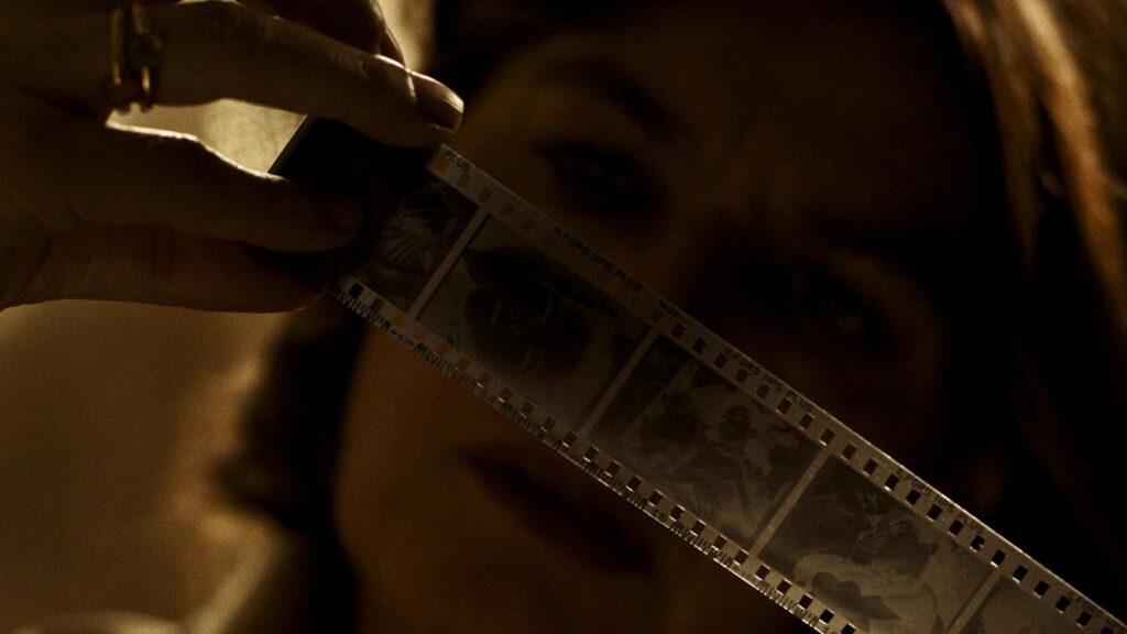
Which are usually the worst.
... So, I asked the production team to save two days of color-grading so I could have another pass with him on the big screen. He said, "Perfect, that's what I want”. It's always a balancing act between the director, the cinematographer and the colorist. I listen a lot to what the colorist, David Haddad, thinks about the spectator's feeling. He knows Rithy well, he's worked with him for a long time, but he still said to me: "We're making a feature film, we're changing visual languages". The camera being digital risked taking the viewer out of the story, and we had to find the look of the fictional part; we were going from one story to another, from one narrative mode to another, and we had to give it homogeneity. Given the archives and Irène Jacob's character’s always holding a camera, we decided to apply a film emulsion. We also wanted an organic image. We ran a few tests on Resolve, and very quickly landed on a base that worked. I had told the production team and Rithy that I was looking for a film-like look, to add personality without distorting the image. You can adjust a lot of parameters, but we played mainly with grain, contrast and saturation, and you can go very far.

So, this film look has its origins in the idea of finding a common base with the archives, whose look has nothing to do with the rest!
Nothing. What's more, they've been digitized too... It would be impossible to look like the archives! We sometimes went back to the original "dirty" look of the archives, so that they could play their role as archives. Rithy was very demanding when it came to how they looked, but they're so old... They haven't been restored. And Rithy kept adding to them, right up to the last moment.
In general, there’s a lot of coverage. How did you deal with the camera movements, in particular the paranoid tracking shots in the narrative parts?
Rithy's cinema can look quite still, and I suggested that he add a little movement. I asked for 10m of track, and we got 3 the first week, plus a slider, which allowed us to start putting in a bit of movement. Rithy asked for more: week two, we had 4 pieces of track. Week three... it came gradually, and by week five we had a real dolly track. I showed it to Rithy, and he was enthusiastic! I think he bought into it, seeing that it was part of the writing process. In his notes of intent, Rithy spoke of a political thriller, a film noir, and for me, who loves this kind of genre cinema, it meant tracking shots, for the oppressive feel. In the end, he asked me to put the camera on tracks. It became a game between us. Since we shot the film more or less chronologically, it came gradually with the story.


Paranoia rises as the tracks get longer...
At the very beginning, the arrival on the tarmac is very calm. The next step was to develop the feelings of the characters and actors. Rithy wanted the shoot to be as chronological as possible, to help the actors, and as the locations were close together, we often returned to the same. This helps a lot and breaks the monotony of a shooting schedule. There are several scenes in the bedrooms, and we didn't shoot them all at the same time.
So, you ended up in Phnom Penh. Very aesthetic sequences in this grandiose and gloomy palace.
It's a trap, you never know if it's going to work. We’re eventually getting to the Meeting of the title, but you don't know where the viewer's imagination is at that moment, do they hope to see him too? Once again, the constraints dictated how we did it.
The location, the governor's residence?
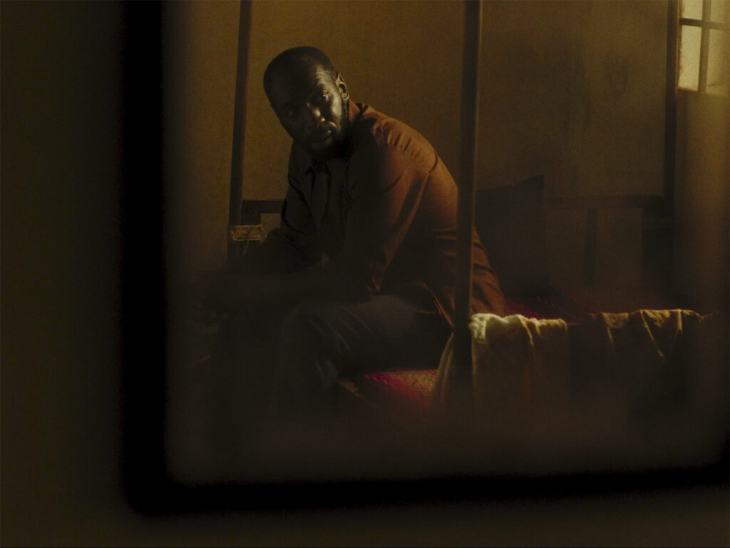
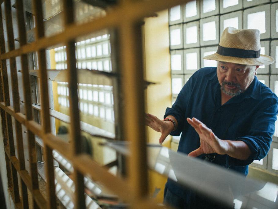
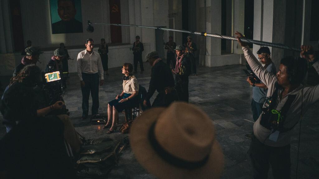
Rithy wanted this residence to show emptiness. Today it's attached to a ministry, so it remains a place of political power: grandiose, oppressive but empty. When I saw the size of the set, I wondered how I could light it... And there were a lot of things we couldn't change, modern elements like the air-conditioning. One solution was to show as little as possible, to give a sense of the space without showing it. Rithy was interested, but it was the constraint of Pol Pot's character that was decisive. The actor we'd planned on withdrew, then the next, then the next... It's a very taboo subject for Cambodians. Rithy himself took on the role. These constraints led us to something much more subtle and interesting. Once again, when you show too much, you spoil everything. And how do you show someone like that? He's already in the film, with all the propaganda portraits... It's more interesting not to see him.

How long did you spend in this mythological looking place?
Two or three days, it went fast. The interview was shot over one afternoon. Even so, we have a director who's moving to the other side of the camera, so he loses the keys to the set, and he didn't want to get under the character's skin either. I'm missing an ally on set to whom the whole team listens. He gave me the keys to the shot list. As the scene was very long, I suggested covering it and doing a lot of shots, not knowing what he wanted to do in the edit. He was so unsettled in that chair, trying not to get under the skin of this character, that for him the shooting was elsewhere. I had to take over, to relieve him too. He didn't even want to look at the monitors. It was very complicated; he couldn't sleep.
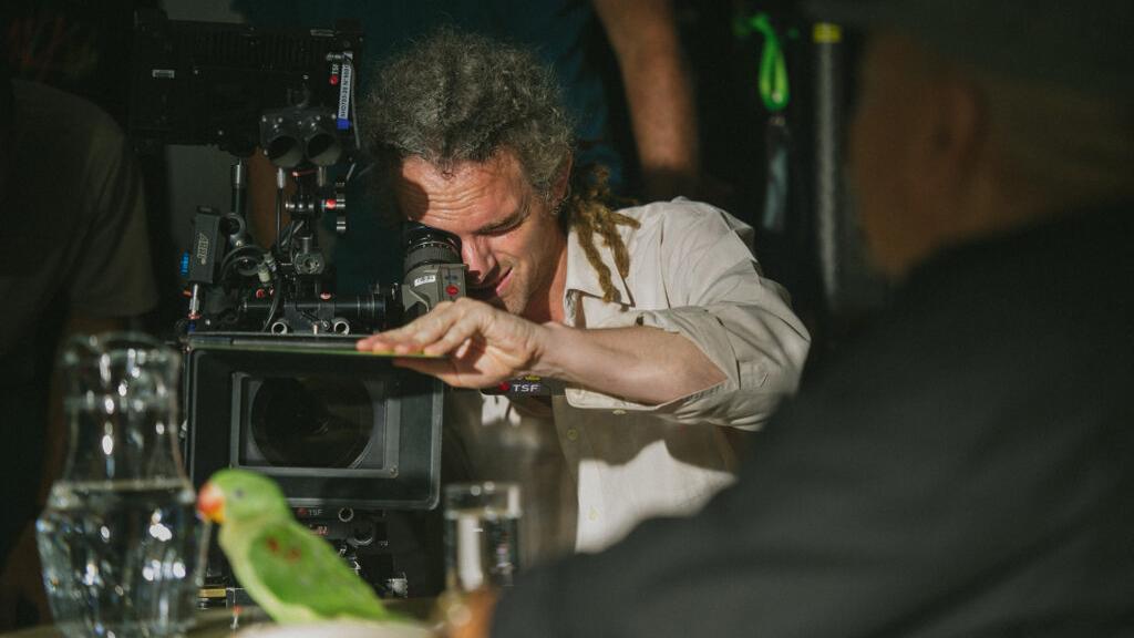


Strangely enough, there’s a humorous undertone to this sequence, perhaps because of the cat and parrot, and the continuity discrepancies.
That's the absurdity of it. Rithy didn't want to learn the lines, for example, so as not to get into character, so he read cue cards, to the point where we were afraid to see them on screen, in the darkness. We had our doubts about this scene, because in the available time it seemed phenomenal, but it was done in a rush, and it works. But I especially love the following scene, with Grégoire Colin. Another difficult scene, and a huge dialogue. But it's a hypnotic scene.
This is the climax, the moment when we're supposed to understand the blindness of Westerners... Even more so than the previous scene, where they fail to come close to the truth.
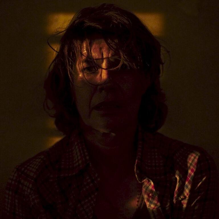
I told Rithy that he had the trailer of the movie with this scene. He sat down in Pol Pot's chair and said "well, we're waiting for Aymerick with his camera and lighting"... I could tell he was impatient; he was fed up with the role. Once again, I took the initiative. It's the fact that you can't see his face that makes it work. We shot the whole thing in one night, and Rithy never saw a single take on set. Grégoire Colin was great, he had the light in his eyes, and after a few takes he was crying... We had two 5Kw tungsten lights punching in through the window, right in front of on him. But it made sense for the role too. He was playing with it; what he gave in this difficulty suited his character. At Cannes, he thanked me, and that's a very gratifying compliment!
After Cannes and the public reception, I'm happy that the film is doing well, but I'm especially happy for Rithy Panh. The film fulfills its mission. Maybe it'll open doors for the next fiction film. He could do a comedy, he's very funny! He said he wanted us to have fun on the set, not suffer. And we had a lot of fun.


David Haddad, colorist of Meeting with Pol Pot, and long-time collaborator of Rithy Panh also took the time to talk to us about his approach and his method.
ZEISS: You've been working with Rithy Panh for a long time, unlike Aymerick.
DAVID HADDAD: Yes, I've made all his films since "The Missing Image" (2013), which was a turning point for him. He was trying something new with models and figurines, to find a new form that was both poetic and personal. It opened a new path for images, and between us. Since then, he has pursued this poetic and formal research through an ever-renewed exploration of the Cambodian genocide. It's a real pleasure when he announces a new project, because I know that we'll always try something new.
Do you see any continuity in his tastes and expectations when it comes to images? He wasn't with you for most of the DI.
Unlike previous films, he couldn’t attend the grading, but his relationship with Aymerick was strong and complementary, and he trusted him completely. So Aymerick and I decided to send him a few stills with our leads right from the start, and that was enough. In the end, the three of us readjusted the final grading. Like other filmmakers who know how to build a team through their projects, he's more trusting than directive. He has precise ideas in mind, and reacts to what we suggest, which gives us a lot of freedom. At the same time, he's very sensitive to grading, especially contrasts, for example, and will feel variations in low blacks with great acuity.

Images in the film come from disparate sources, between figurines, archives and fiction filmed by Aymerick. What was your methodology?
We worked on the film in the order in which it was edited. The idea was both to draw inspiration from what I'd done on the prior movies, and to support Aymerick’s cinematography following Rithy’s storytelling. Technically, the images weren't shot in the same way (different camera and lenses, "studio" lighting) not by the same team, but it didn’t matter that much. I try not to worry too much about the technical side of things, but rather to focus on the feel of the image. It's a more psychological, even maieutic relationship: something’s being born; it's the last step, where all the things that haven't come to fruition must find closure. We gather what’s been scattered and try to find continuity. It’s done very quickly, in a few moments for a picture, and a few days for a film. It's more a question of understanding and accompanying in a sensitive way than of focusing on technical settings. Finding a contrasting, saturated or soft image is subjective to an extent you can't imagine! As Aymerick and I didn't know each other beforehand, I took the time to understand what a warm or cold image meant to him, a green or magenta skin. I was rather curious about what Aymerick liked, how he conceived his images, the adaptability of his filming process, and his experience with Asian cinema. He likes very dense, high-contrast images, with lots of information in the blacks, and he played a lot with backlighting, as in the bedrooms where the three characters are held back. He brought this language to the film, which naturally complemented Rithy's. I think they really found each other there, the images resembling both of them.
Soon enough, there was a discussion about the style of the images, the 4:3 aspect ratio being a strong choice. We decided to suggest the 1970s filmstock, rather than doing an style exercise. The feeling given by the outdoor light was our base. We applied a very light 35 mm grain emulation developed with Dehancer in Resolve, which is more about sensation than perception. We also played with a form of color dispersion in the blacks to meet a slight Ektachrome quality, by a few points. I have friends who went to see the film in cinemas without knowing the context, and remained unsure about the era in which it takes place for quite a while. I thought it was great. Aymerick and I said we'd leave room for interpretation, and the color-grading tried to go with the minimalist staging and photography. I’m sure this uncertainty gives the film strength.