From Image to Results - High-content siRNA Screen for Cytoskeleton Regulation
Dr. Lorna Young
Author

Dr. Lorna Young

Research Associate, Zech Lab
University of Liverpool

Author

Dr. Philipp Seidel

Product Marketing Manager Life Sciences Software
ZEISS Microscopy

Abstract

From Image to Results | High-content siRNA Screen for Cytoskeleton Regulation

In this new series "From Image to Results", explore various case studies explaining how to reach results from your demanding samples and acquired images in an efficient way. For each case study, we highlight different samples, imaging systems, and research questions.

In this fifth episode, we explore how to combine Data Science tools in microscopy with automated high-content imaging in an experimental screening setting. We obtained image data from Dr. Lorna Young of the Zech Lab in the Department of Molecular Physiology & Cell Signalling at the University of Liverpool (learn more). The research focus of this group centers around cellular migration and invasion. Hence, this use case will take us into the biology of the cellular cytoskeleton (learn more).

Case Study Overview

Sample

U-2 OS osteosarcoma tumor cell line

Task

High-content characterization of cytoskeleton and cellular adhesions in siRNA screen

Results

Classification of cellular responses to gene silencing

System

ZEISS Celldiscoverer 7 with LSM 900

Software

ZEISS arivis Pro, ZEISS ZEN

Introduction

Figure 1: Structure of Actin and Microtubule Filaments

Figure 1: Structure of Actin and Microtubule Filaments

Figure 1: Structure of Actin and Microtubule Filaments

Figure 1: Structure of actin and microtubule filaments. Both filaments have in common that they are dynamically assembled by the addition of single monomers, controlled by a multitude of regulatory enzymes , including RhoGTPases.

Figure 1: Structure of actin and microtubule filaments. Both filaments have in common that they are dynamically assembled by the addition of single monomers, controlled by a multitude of regulatory enzymes , including RhoGTPases.

The cytoskeleton is key to determining cellular shape as well as cellular functions such as vesicle trafficking, cell adhesion or cell migration. Cytoskeletal filaments like microtubules or actin microfilaments (Figure 1) are, simultaneously, the foundation for dictating a cell’s shape and the contact point for motor proteins (kinesins and myosins) to contract filaments or deliver vesicle cargo to different locations within the cell. Attachment points of filaments at the cell membrane are referred to as junctions. One such junction consists of focal adhesions (learn more) which form the spot-like contact points between the extra-cellular matrix and actin filaments (Figure 2).

Figure 2: Structure of Focal Adhesions

Figure 2: Structure of Focal Adhesions

Figure 2: Structure of Focal Adhesions

Figure 2: Structure of focal adhesions. These form the contact points between the extracellular matrix and the actin cytoskeleton. Notice the variety of proteins that regulate strength and tension (e.g. myosin).

Figure 2: Structure of focal adhesions. These form the contact points between the extracellular matrix and the actin cytoskeleton. Notice the variety of proteins that regulate strength and tension (e.g. myosin).

Dr. Young is interested in the cellular regulation of actin cytoskeleton. To generate new hypotheses, she has set up an siRNA screen for RhoGTPases (learn more), a family of cellular enzymes that have diverse roles in the formation of filaments and adhesion complexes, e.g., by regulating the dynamic assembly of filament monomers (Figure 1). Within each individual sample, one specific RhoGTPase is downregulated via the siRNA and therefore cannot exert its normal cellular function. With this setup, individual Rho GTPases that alter the cell’s morphology, cytoskeleton or cellular adhesions in a particular fashion can be detected.

For an unbiased approach via imaging, several molecular read-outs must be detected at once. In the current setup, cells are stained for actin and microtubuli, and for VASP, which is a marker within focal adhesions. Using these markers permits the use of automated imaging and image analysis processes to simultaneously measure a large array of cellular features on a single-cell level. To manage this wealth of information, data analysis tools like clustering algorithms can be applied to find the systematic patterns of morphology changes.

Material and Methods

The image data we obtained from Dr. Young was acquired on ZEISS Celldiscoverer 7 with LSM 900 in the ZEISS demo center in Oberkochen, under the supervision of Dr. Frank Vogler.

Cells were grown on a 96-well plate and treated with an siRNA library.

Cells were then fixed and stained with Hoechst (cellular nuclei), phalloidin (actin), tubulin antibody (microtubules) and VASP antibody (focal adhesions).
Images were acquired at 50X resolution employing Airyscan (Scan Speed 8), with 5x5 tiles for each of the 96 well positions at 16-bit pixel resolution. The raw images were then Airyscan-processed (FastAiryscanSheppardSum) and stitched within ZEN (blue edition), resulting in a data set of approximately 30 GB. Several experimental replicates were recorded. However, for purposes of demonstration, only one of these data sets was considered for further analysis in this application story.

The .czi files were then imported directly into ZEISS arivis Pro for image analysis. To generate a suitable data set for the application story, all channels were binned (4x4) to generate a final data set size of ~1.3 GB.

ZEISS arivis Pro
arivis logo

ZEISS arivis Pro

ZEISS arivis Pro  is a modular software for working with multi-channel 2D, 3D and 4D images of almost unlimited size, highly scalable and independent of local system resources. Many modern microscope systems such as high-speed confocal, light sheet / SPIM, super-resolution, electron microscopy or X-ray instruments can produce huge amounts of imaging data. ZEISS arivis Pro handles such datasets without constraints and in relatively short time.

Software Processing

Image Analysis Pipeline

The purpose of this high-content image analysis in ZEISS arivis Pro was to obtain as much correlative information as possible. That means: Measure all features based on the same fundamental and meaningful biological entity, which is the single cell.

For this approach, the single cells needed to be segmented using an automated yet robust process. A three-step segmentation process was initiated to ensure proper assignment of cell boundaries, even for cells growing in close proximity to one another. First, single nuclei were segmented with automated intensity-based thresholding (Li method), then split and filtered for dead (condensed/small) nuclei. Second, the nucleus segmentation objects were enlarged using Region Growing with Membrane-based Watershed based on the actin channel. This ensured that the segmentation recognized the primary outer boundary of a cell, which is normally strongly positive for actin. Third, to further expand this process to all remaining cell areas, Region Growing was repeated, this time with standard Watershed settings and with an artificial merged channel consisting of actin, microtubules and focal adhesions, resulting in final “Cell Body” objects.

Actin, microtubules and focal adhesions were independently segmented: actin and microtubuli with Watershed segmentation; focal adhesion spots with Blob Finder. To link all these segmentations to single cells, compartments were generated with Cell Bodies as parents and Nuclei, actin, microtubule and focal adhesion segments as children. Finally, to obtain statistics on the level of samples, Compartments were grouped by sample. The complete image processing scheme is shown in Figure 3 and the pipeline is available for download.

As a final step within ZEISS arivis Pro, an array of cellular features was extracted with the Object Manager, both for single cells and for the complete samples (Figure 4). These data matrices included cell morphology features for cell body and nucleus (area, intensity and roundness). They also included various features for actin, microtubules and focal adhesions (intensities, areas and object numbers). The matrices were then analyzed with Clustergrammer, a public Python -based tool for cluster analysis (learn more).

  • Image Processing scheme for arivis Vision4D.

    Figure 3: Image Processing scheme for ZEISS arivis Pro.

Population Statistics (Average per Cell)

Single-cell Statistics

Number of cells

Sample ID

Cell Size

Cell Size

Nuclear Size

Nuclear Size

Nuclear Intensity

Nuclear Intensity

Nuclear Shape

Nuclear Shape

Number of FA per cell

Number of FA per cell

FA intensity per cell

FA intensity per cell

Actin intensity per cell

Actin intensity per cell

MT intensity per cell

MT intensity per cell

FA area per cell

FA area per cell

Actin area per cell

Actin area per cell

MT area per cell

MT area per cell

FA area / cell area

FA area / cell area

Actin area / cell area

Actin area / cell area

MT area / cell area

MT area / cell area

Int of Focal Adhesions (single)

Average single FA area

Area of Focal Adhesions (single)

Average single FA intensity

Figure 4: Feature lists for quantification on population level and single-cell level.

Execution in ZEISS arivis Pro

Segmentation of Cell Bodies

In this tutorial, learn how to use ZEISS arivis Pro to carry out segmentation of cell bodies from a 96 well plate, that was captured on a ZEISS Celldiscoverer 7 imaging system. In this study, we are interested in segmenting a number of structures for each cell, such as the nucleus, the microtubules, the actine fibers, and the focal adhesions.

Group Statistics

In this tutorial, learn how to set up custom statistics in ZEISS arivis Pro in order to aggregate result data, so it is available for review quickly and easily.

Validation

In this image analysis scheme, two processing stages were crucial to obtain proper results and therefore needed visual inspection during setup and thereafter. First, to enable robust single-cell analysis with minimal artifacts, a robust segmentation of cell bodies was key. We therefore approached this by a series of segmentations building up on top of each other. In the first step, cell nuclei were identified. This is the cleanest way to ensure appropriate identification of cells because, of course, each cell has only one nucleus. Next, the cell areas were enlarged by Region Growing, employing their nuclei as seeds and the actin cytoskeleton as membrane boundaries. As actin generally forms a characteristic outer ring around each cell, this was a reliable way of ensuring that the cell bodies were assigned to the proper nuclei. Third, to catch any areas not detected in the previous steps, Region Growing was applied again to all available image channels. This three-step segmentation process is illustrated in Figure 5. As shown in these images, this processing scheme generated a meaningful, accurate detection of cell bodies with only a small percentage of areas (<10%) being assigned to the wrong cell.

Next, we review the images to verify that microtubule, actin and focal adhesion detection have been assigned to the correct parent cell body. Example images shown in Figure 6 demonstrate that actin and microtubule areas were detected accurately, and because channels were pre-processed with image intensity normalization and a top-hat filter, low-intensity filament areas were detected as well. However, there were some errors in detection of homogeneous high-intensity areas (<10%). Focal adhesions were accurately detected. By employing Blob Finder, both high-intensity and low-intensity focal adhesions could be detected. Figure 6 also uses color coding to show that all object groups were assigned properly to the underlying cell body.

Figure 5: Three-step segmentation process for detection of cell bodies. First, nuclei are detected based on Hoechst channel. Second, cell areas are detected by Region Growing from nucleus segments based on Actin channel. Third, final Cell Body segments are detected by Region Growing based on merged channels.

Figure 5: Three-step segmentation process for detection of cell bodies. First, nuclei are detected based on Hoechst channel. Second, cell areas are detected by Region Growing from nucleus segments based on Actin channel. Third, final Cell Body segments are detected by Region Growing based on merged channels.

Figure 5: Three-step segmentation process for detection of cell bodies. First, nuclei are detected based on Hoechst channel. Second, cell areas are detected by Region Growing from nucleus segments based on Actin channel. Third, final Cell Body segments are detected by Region Growing based on merged channels.

Figure 5: Three-step segmentation process for detection of Cell Bodies: Cell areas are detected by Region Growing from nucleus segments based on Actin channel.

Figure 5: Three-step segmentation process for detection of Cell Bodies: Cell areas are detected by Region Growing from nucleus segments based on Actin channel.

Figure 5: Three-step segmentation process for detection of Cell Bodies: Cell areas are detected by Region Growing from nucleus segments based on Actin channel.

Figure 5: Three-step segmentation process for detection of Cell Bodies: Cell areas are detected by Region Growing from nucleus segments based on Actin channel.

  • Visual validation of image analysis segmentations.

    Figure 6: Visual validation of Image Analysis segmentations. Original image channels are shown in the upper row, resulting segmentations are shown in the lower row. Notice the common color coding to represent assignment to the underlying Cell Bodies.

Results

Figure 7: Distribution of cell numbers per well. Note the large spread of cell numbers over samples.

General Qualitative Cellular Responses to siRNA Treatment

In reviewing the data, we can look at the general characteristics of the data set. First, we checked the distribution of cell numbers (Figure 7). Per sample, a median of 118.5 cells were detected while displaying a large spread from 10 to 300 cells. This suggests that the siRNA treatment was effective in having considerable impact on the viability of cells.

Figure 8a: Example images showing the variation of quantitative read-outs within the data set; here cell body size is shown. Sample IDs are shown with every image.

Figure 8a: Example images showing the variation of quantitative read-outs within the data set; here cell body size is shown. Sample IDs are shown with every image.

Figure 8a: Example images showing the variation of quantitative read-outs within the data set; here cell body size is shown. Sample IDs are shown with every image.

Figure 8a: Example images showing the variation of quantitative read-outs within the data set; here cell body size is shown. Sample IDs are shown with every image.

Figure 8a: Example images showing the variation of quantitative read-outs within the data set; here cell body size is shown. Sample IDs are shown with every image.

Next, we examined whether siRNA treatment generated detectable responses concerning the cellular cytoskeleton composition. Figure 8 (a-d) shows that there were considerable differences in the expression and/or formation of microtubules, actin and focal adhesions, as well as cell body size (a consequence of cytoskeleton changes). Hence, we can verify that the siRNA treatment generated the desired cytoskeletal responses, and therefore, the data set is suitable for further data analysis.

Figure 8b: Example images showing the variation of quantitative read-outs within the data set; here focal adhesion intensity (orange) is shown. Sample IDs are shown with every image.

Figure 8b: Example images showing the variation of quantitative read-outs within the data set; here focal adhesion intensity (orange) is shown. Sample IDs are shown with every image.

Figure 8b: Example images showing the variation of quantitative read-outs within the data set; here focal adhesion intensity (orange) is shown. Sample IDs are shown with every image.

Figure 8b: Example images showing the variation of quantitative read-outs within the data set; here focal adhesion intensity (orange) is shown. Sample IDs are shown with every image.

Figure 8c: Example images showing the variation of quantitative read-outs within the data set; here actin intensity (purple) is shown. Sample IDs are shown with every image.

Figure 8c: Example images showing the variation of quantitative read-outs within the data set; here actin intensity (purple) is shown. Sample IDs are shown with every image.

Figure 8c: Example images showing the variation of quantitative read-outs within the data set; here actin intensity (purple) is shown. Sample IDs are shown with every image.

Figure 8c: Example images showing the variation of quantitative read-outs within the data set; here actin intensity (purple) is shown. Sample IDs are shown with every image.

Figure 8d: Example images showing the variation of quantitative read-outs within the data set; here microtubule intensity is shown (green). Sample IDs are shown with every image.

Figure 8d: Example images showing the variation of quantitative read-outs within the data set; here microtubule intensity is shown (green). Sample IDs are shown with every image.

Figure 8d: Example images showing the variation of quantitative read-outs within the data set; here microtubule intensity is shown (green). Sample IDs are shown with every image.

Figure 8d: Example images showing the variation of quantitative read-outs within the data set; here microtubule intensity is shown (green). Sample IDs are shown with every image.

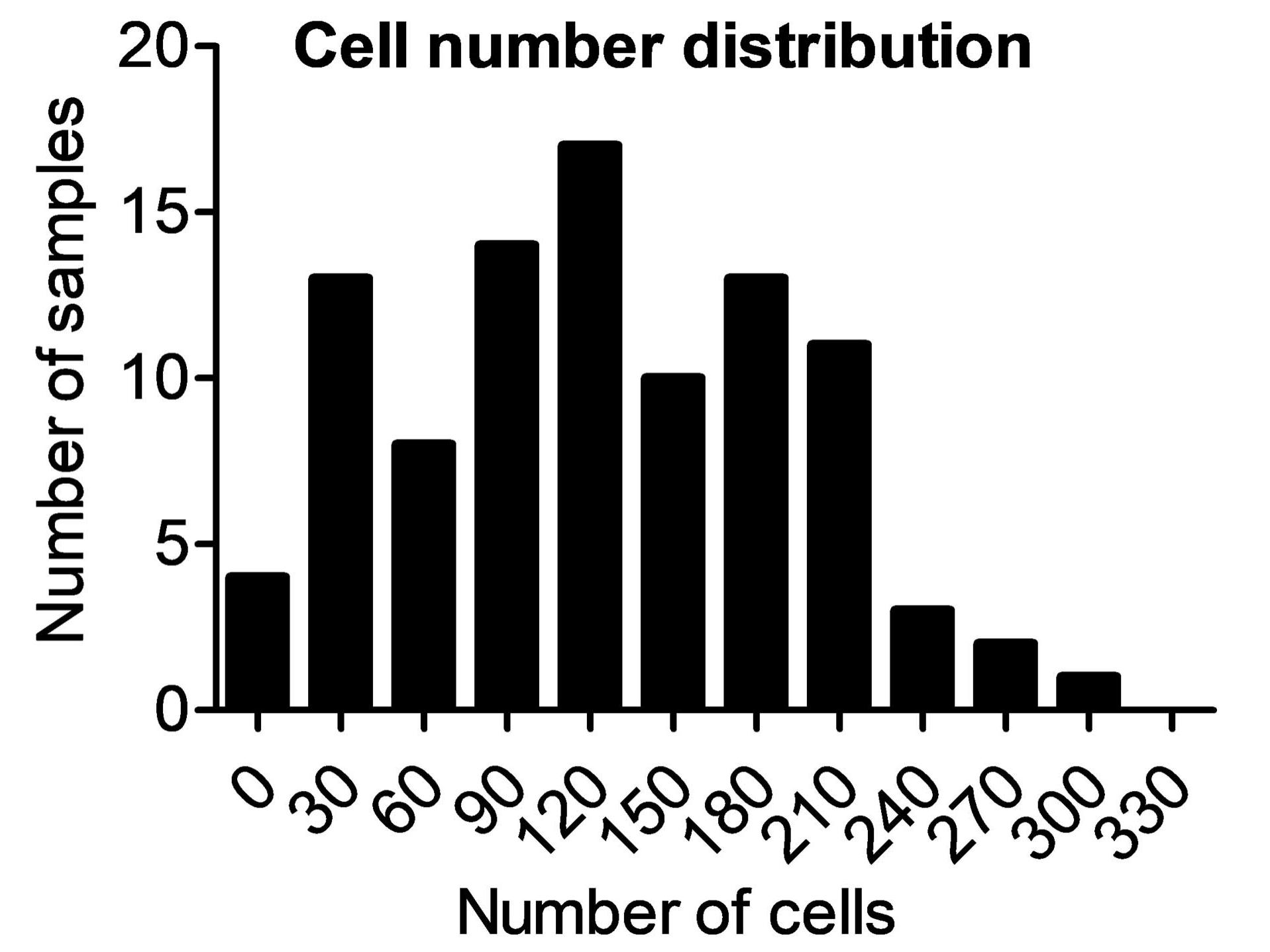
Cluster Analysis on the Single Cell Level

Normally at this stage of the study, we would examine single quantitative features and plot them, thereby describing observations and formulating biological conclusions. However, having obtained multidimensional quantitative output from this data set allowed us to apply more advanced data analysis tools. With such approaches, all features are examined together in an objective fashion to find systematic deviations, if any exist. Cluster analysis is a method that categorizes cells or samples based on the entirety of extracted features and sorts them into groups exhibiting the highest similarity.

Features in this data set vary over several orders of magnitude, with some displaying very large values (e.g., the pixel sum intensities of the nucleus) while other values are rather small (e.g., actin area fraction). For the cluster algorithm, the data needs to be normalized. This was achieved by dividing every value by the average value, then by the standard deviation of the specific feature. Here, we additionally log-transformed the data set.

To clarify the large number of data points generated, the results are then typically plotted as a heatmap. Figure 9A shows the heatmap for every single cell grouped by the sample they belong to (= siRNA treatments; notice the SampleID color code). The feature pattern shows that the experimental features vary considerably between samples but are consistent within a sample. Figure 9B shows the same data clustered for feature similarity. It becomes apparent that cells from many different samples will cluster into groups of similar phenotypes. Examining the features within these clusters shows that different feature combinations can be observed. There is, for example, a cluster that shows high abundance of actin and microtubules, and yet another cluster shows high abundance of focal adhesions.

Of note in Figure 9B, not only cells are clustered by similarity in Figure 9B, but also the underlying measurement features. Features that occur in the same cluster show similar responses for all samples. Examining feature clusters allows identification of common regulation patterns. For example, when we see a feature cluster for nucleus intensity and area, it means, of course, that they are most likely commonly regulated. The features “Single Focal adhesion intensity” and “Focal adhesion numbers per cell” do not occur in the same cluster and thus are likely not commonly regulated, which might come as a surprise. Many other observations can be revealed with further analysis of the data set, but these will not be discussed here for the sake of brevity. However, using the criteria presented in this example, we hope to illustrate that such correlative analysis can be information-rich and revealing.

  • Figure 10: Cluster analysis of data set on the single-cell level.

    Figure 9: Cluster analysis of data set on the single-cell level. Red bars represent increased values, blue bar represent decrease values. Grey marks at the plot edges represent clusters. (A) Heatmap with single cells are shown in the order of samples. Notice the additional first column with color codes for the Sample ID. (B) Cells are re-ordered to show clusters of similar responses. Note that cells from many different samples tend to show similar responses.

Figure 11: Samples that cluster together into groups and subgroups (=clusters).

Figure 11: Samples that cluster together into groups and subgroups (=clusters).

Cluster Analysis at the Sample Level

The same type of methodology also can be applied to features measured on a sample level. ZEISS arivis Pro allows generation of such statistics easily by grouping all objects of a sample.

One advantage of the sample-centric analysis for this data set is the direct comparison of similarities in the individual siRNA treatment effects. This can, in principle, be done directly in the standard heatmap (Figure 10B). As in the previous section, the map can be studied to find correlations between samples and their features.

A very useful alternative visualization of clusters is a similarity map. Instead of feature values, this map directly displays the statistical similarity scores calculated during the clustering, with high similarity shown in red and low similarity shown in blue. Hence, the similarity matrix is a cross matrix with the same categories on both axes (Figure 10A/C).

Using the similarity map for our samples (Figure 10C), we can now easily view clusters and their corresponding Sample IDs (Figure 11). To show that the automated cluster analysis generated meaningful results, the original images of some of the clusters are shown in Figure 12. Here, multidimensional data extraction and the cluster algorithm worked quite well to identify similarities and differences of the wide range of cellular phenotypes.

  • Figure 10: Cluster analysis of data set on the sample level.

    Figure 10: Cluster analysis of data set on the sample level. A clustered heatmap is shown in the center image, red bars represent increased values, blue bar represent decrease feature values. Similarity maps are shown in panels A and C. These compare categories of the same kind for strong (red) vs. weak (blue) similarity.

  • Figure 12: Original images from various clusters as determined by sample-centric cluster analysis. For each cluster, the characteristic differentiating features are displayed.

    Figure 12: Original images from various clusters as determined by sample-centric cluster analysis. For each cluster, the characteristic differentiating features are displayed.

Summary

In this application story, we highlighted an approach to high-content analysis using advanced data analysis methods. We also showed that ZEISS imaging systems like Celldiscoverer 7 and ZEISS arivis Pro are well equipped to be employed in such experimental schemes.

We demonstrated how high-content analysis can be an incredibly powerful method for hypothesis generation and validation. You saw how this type of analysis can be scaled easily or adapted to new features. In this use case, we could have acquired more markers, have chosen a larger number of features or have specified more complex features to further refine the analysis. The general procedure would have remained the same as demonstrated. Likewise, cluster analysis is just one of many data analysis tools at our disposal. We could have chosen to use additional or more complex data analysis tools. Also, when also considering linking the imaging results to other experimental data, the information content can grow exponentially. Incorporating siRNA gene data (gene function information, gene interaction networks, etc.) would have been a logical next step in this data set but was omitted here for the sake of brevity.

Scalable Analysis with arivis VisionHub

Finally, with the recent development of the arivis VisionHub web-based platform, it is possible to scale analysis of an experiment to include batch processing of images. After analysis pipelines have been created in ZEISS arivis Pro, they can quickly be uploaded to arivis VisionHub for use in high-content, server-side analysis. This can significantly reduce analysis times while also making results readily available online to share with collaborators.

A typical workflow could involve a microscope scanning a 96-well plate, with the acquired images being exported automatically to VisionHub. VisionHub could then batch analyze the images and make the results available for viewing. Both image and result data can be accessed easily by multiple users, thereby facilitating collaboration. The data also can be downloaded from VisionHub as a single or combined .csv file.

Additionally, digital time stamps allow for full traceability within your study, while granular access rights allow you to control who has access to what data and functions.

As always, we provide here our data set and analysis pipeline for you to test and learn about ZEISS arivis Pro.


Share this article